Data-Driven Design: Using Analytics to Improve UX and Conversion Rates
Good design decisions feel intuitive. The best ones are backed by evidence.
Data-driven design is the practice of using real user behaviour, collected through analytics tools, to inform and validate design choices. Rather than relying solely on instinct or established best practice, teams use data to understand what is actually happening when people interact with a product, and then make targeted improvements based on what they find.
This does not mean replacing creativity with spreadsheets. It means giving designers, product managers and developers a shared language for prioritising work and measuring impact. And when it comes to conversion rates in particular, the difference between data-informed decisions and guesswork can be significant.
If you’re interested in the human side of UX, you might also enjoy our three-part series on the psychology behind user experience, which covers cognitive psychology, emotional design, and behavioural patterns in UX.
What Does “Data-Driven” Actually Mean in UX?
Data-driven design means treating user behaviour as a source of evidence. When a page has a high drop-off rate, when users consistently abandon a form at the same field, or when a button gets ignored despite being prominently placed, those patterns tell a story. The designer’s job is to read that story correctly and respond to it.
The key distinction is between quantitative data (what is happening, expressed in numbers) and qualitative data (why it is happening, gathered from session recordings, interviews, and open feedback). Both are necessary. Numbers reveal the problem; context explains it.
Key Metrics to Track
Before diving into tools, it helps to clarify which metrics are actually useful for UX and conversion work.
- Bounce rate: the percentage of users who leave after viewing a single page. A high bounce rate on a landing page can indicate a mismatch between what users expected and what they found.
- Time on page: how long users spend on a given page. Low time on content-heavy pages can suggest poor readability or layout issues; unexpectedly high time on a checkout step may indicate confusion.
- Funnel drop-off rate: at which stage of a multi-step process (checkout, sign-up, onboarding) users abandon. This is one of the most actionable metrics for conversion optimisation.
- Click-through rate (CTR): the proportion of users who interact with a specific element, such as a CTA button or a navigation link. Low CTR on a primary CTA often signals a positioning or copy issue.
- Task completion rate: whether users successfully complete a defined goal, such as finishing a purchase or locating specific information.
No single metric tells the full story. Tracking them together, and comparing them over time or across user segments, is where the real insight comes from.
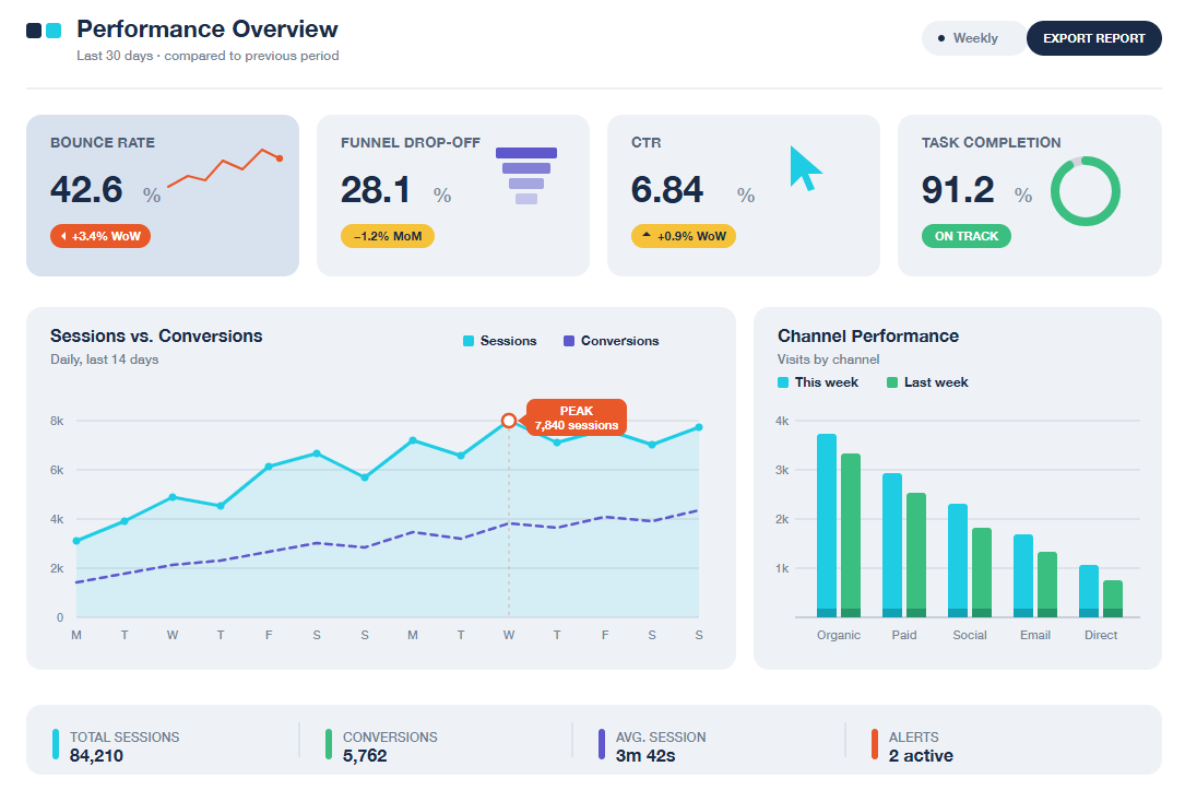
Data dashboards are extremely useful to show key UX metrics at a glance
Tools for Understanding User Behaviour
A wide range of analytics tools exists, each suited to different kinds of questions.
Quantitative tools
Tools like Google Analytics 4 (GA4) and Mixpanel provide aggregate data on traffic, user flows, conversions and retention. They answer questions such as: where are users coming from, where do they go, and where do they stop?
Example: Funnel analysis in GA4 By setting up a conversion funnel that mirrors a checkout flow (product page → cart → checkout → confirmation), teams can see at a glance which step loses the most users. If the majority of users who reach the cart page never proceed to checkout, that step deserves attention, whether the cause is unexpected costs, a confusing layout, or an absence of trust signals.
For teams working under strict data governance requirements, particularly those involved in EU-funded projects or public sector initiatives, Matomo is a strong alternative worth considering. As an open-source platform that can be self-hosted, it provides comparable analytics features (funnel analysis, goal tracking, user flow visualisation) while keeping all data entirely within the organisation’s own infrastructure. No data is shared with third parties, which makes it well aligned with GDPR compliance obligations and a common requirement in European Commission-funded projects where data sovereignty is a contractual concern.
Qualitative tools
Tools like Hotjar, Microsoft Clarity, and FullStory complement quantitative data by showing how users interact with a page. Their core features include:
- Heatmaps: aggregate visualisations of where users click, tap, scroll, or hover. They reveal which elements attract attention and which are overlooked entirely.
- Session recordings: anonymised video replays of individual user sessions. Watching users navigate a form with a high abandonment rate often surfaces friction points that no metric alone would identify.
- On-page surveys: short, contextual prompts that ask users why they are leaving a page or what stopped them from completing an action.
Example: Spotting friction with a heatmap A common finding in heatmap analysis is that users click on non-interactive elements they expect to be links, such as images, headings, or icons, because the visual design implies interactivity. Identifying and addressing this kind of false affordance can reduce frustration and improve task completion rates.
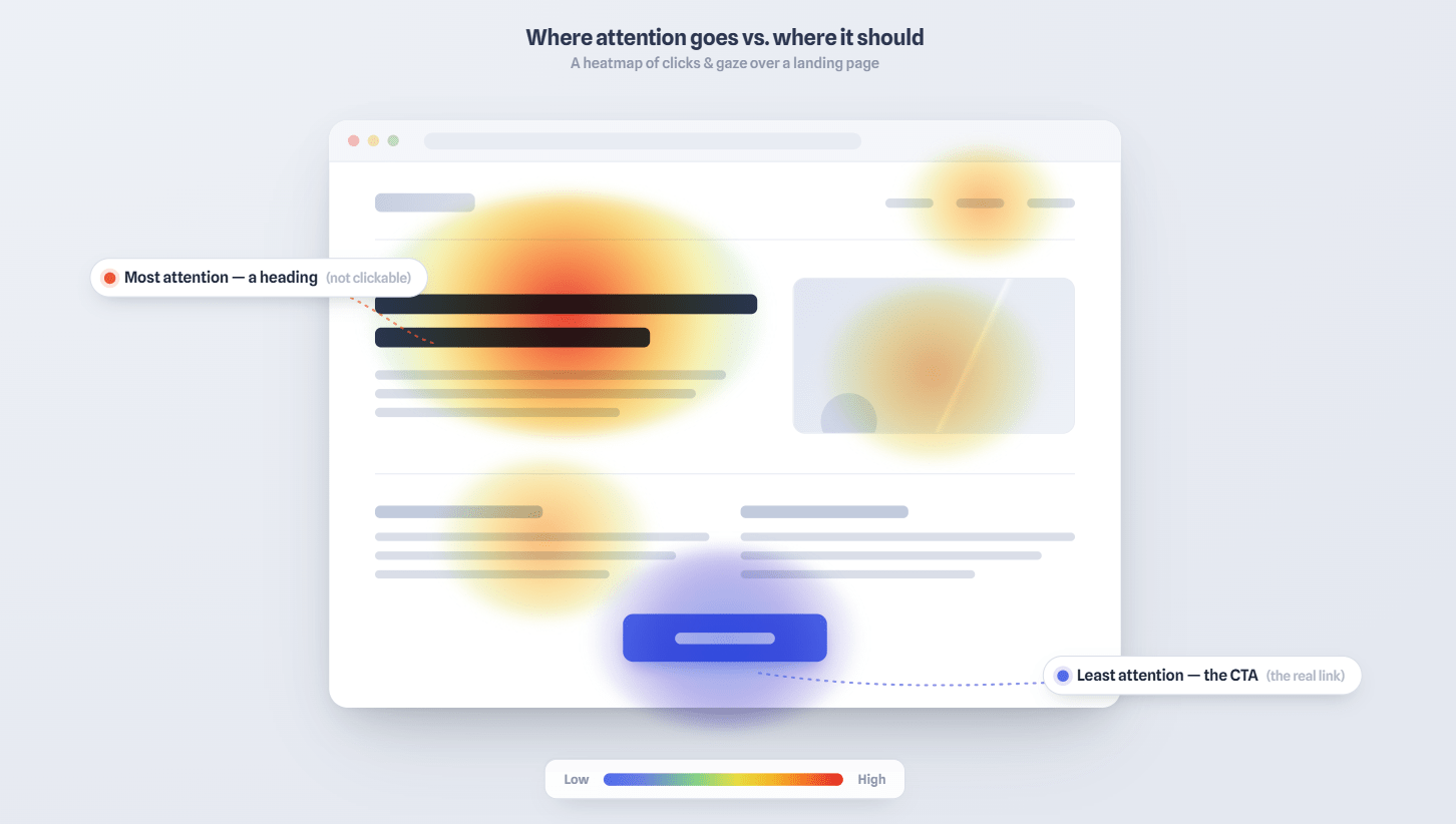
In this sample heatmap of a web page, a “hot area” shows high click concentration on a non-interactive heading element
A/B Testing: Turning Hypotheses into Improvements
Once a problem has been identified and a hypothesis formed, A/B testing provides a structured way to validate a potential solution before rolling it out.
In an A/B test, two variants of a page or element are shown to different groups of users simultaneously. The variant that performs better on the defined metric (clicks, conversions, sign-ups) becomes the default.
Example: Button copy and CTA placement A team notices that their primary CTA has a low CTR. They hypothesise that the copy is too generic (“Submit”) and the button is placed too far down the page. Running an A/B test with revised copy (“Get your free quote”) and a repositioned button allows them to measure the impact of each change independently, and make a decision based on actual user behaviour rather than internal opinion.
Design tip: A/B tests require sufficient traffic to produce statistically meaningful results. Running a test on a low-traffic page for a short period can generate misleading conclusions. Tools like Optimizely, VWO, or the built-in experimentation features in GA4 can help structure tests and interpret results reliably.
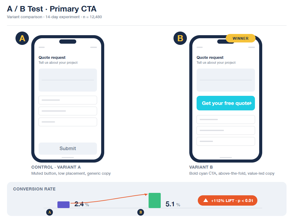
A/B testing in practice: each variant is shown to a separate user group, and the data decides which one stays
Data Without Context Is Just Numbers
One of the most common pitfalls in data-driven design is treating metrics as conclusions rather than starting points. A high bounce rate on a blog post, for instance, might simply mean users found what they needed quickly, with no underlying problem at all.
Similarly, optimising too narrowly for a single metric can inadvertently worsen the overall experience. A more prominent, more aggressive CTA button might increase clicks in the short term while reducing trust and repeat visits over time.
The most effective teams use data to ask better questions, not to replace the need for judgement. Understanding what users do is most valuable when combined with an understanding of why they do it, which is where UX research, usability testing, and the psychological principles behind user behaviour come back into the picture.
Conclusion
Data-driven design is not a methodology that makes design objective. It is a discipline for making design decisions more transparent, testable, and grounded in real user behaviour. When combined with strong UX principles and a clear understanding of how users think and feel, analytics can meaningfully improve both experience quality and conversion performance.
The goal is a feedback loop: observe, hypothesise, test, learn, and repeat.
If you’d like to bring a more data-driven approach to your digital product, from analytics setup and UX audits to A/B testing and conversion optimisation, our team is ready to help. Contact us today.