The Psychology Behind User Experience: Part 2 – Emotional Design
User Experience (UX) design is about more than just functionality; it’s also about creating an emotional connection with users. In this second part of our series, we’ll explore the concept of emotional design and its impact on UX.
If you’ve missed the first part, you can read here: Part 1 – Cognitive Psychology and UX
Emotional Design and UX
Emotional design focuses on creating products that elicit positive emotions, leading to better user satisfaction and engagement. By understanding how users feel and react, designers can craft experiences that resonate on a deeper level.
The Role of Emotions in User Experience
Emotions play a crucial role in how users interact with a product. Positive emotions can enhance user satisfaction, increase engagement, and foster loyalty, while negative emotions can lead to frustration and abandonment.
Example: The “Like” button on Facebook is a simple yet powerful tool for evoking positive emotions. By allowing users to express approval, it creates a sense of connection and satisfaction. This positive reinforcement encourages users to return and engage more frequently.
Techniques to Evoke Positive Emotions Through Design
- Colour Theory and Emotional Responses
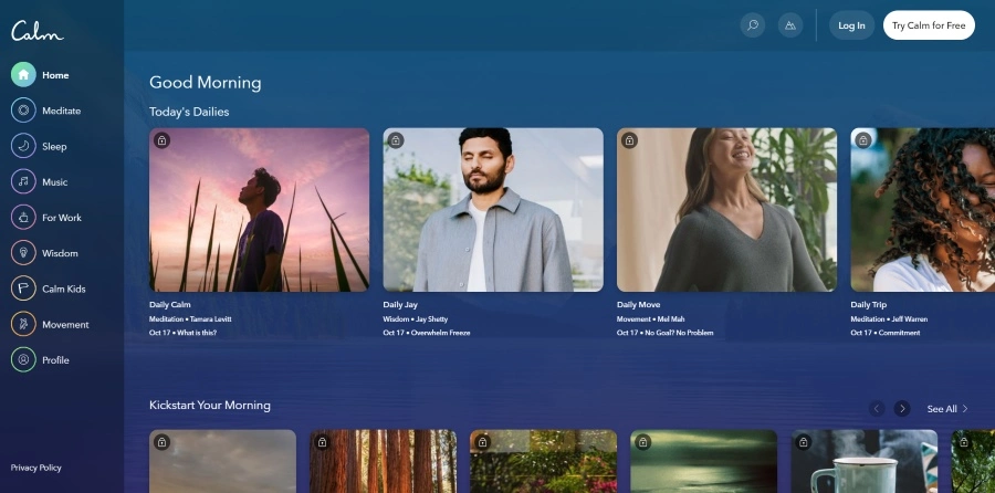
Different colours evoke different emotions. For example, blue can create a sense of calm and trust, while red can generate excitement and urgency. Choosing the right colour palette can significantly impact how users feel about a product.
Example: Calm, a popular meditation app, uses a soothing blue colour palette to create a tranquil and relaxing user experience. This aligns with the app’s goal of reducing stress and promoting mindfulness. - Micro-Interactions
Micro-interactions are small, delightful animations or responses that make the user experience more enjoyable. Examples include a loading spinner that turns into a checkmark once a task is complete or a playful animation when a user adds an item to their cart.
Example: Slack’s playful loading messages and animations, such as cheerful illustrations and witty remarks, add a touch of personality to the user experience. These micro-interactions make waiting times feel shorter and more enjoyable.

Case Studies of Emotionally Impactful Designs
- Airbnb’s Storytelling Approach: Airbnb uses storytelling to create an emotional connection with users. High-quality images, personal stories from hosts, and inspirational travel guides evoke a sense of adventure and belonging. For example, the “Experiences” section on Airbnb showcases unique activities hosted by locals, creating a narrative that resonates with users’ desire for authentic travel experiences.
- Duolingo’s Gamification: Duolingo incorporates gamification elements like points, badges, and streaks to make learning a new language fun and engaging. The app’s friendly mascot, Duo, provides encouragement and feedback, enhancing the emotional experience. For instance, Duo’s celebratory animations when users achieve their goals add a sense of achievement and motivation.

Emotional design is a powerful tool in UX design. By understanding and leveraging emotions, designers can create products that not only function well but also create meaningful connections with users.
This series continues in Part 3, where we explore behavioural and social psychology in UX design.
If you’re looking to create digital products that connect with users on an emotional level, contact us today. Our team of experts is ready to help you enhance your UX design.