UI Design: Staying Ahead of Design Trends
In 2025, digital design will be transformed by innovation, opening up new opportunities. Designers are increasingly thinking outside the box to create experiences that are not only useful but also genuinely captivating and influential. This year’s trends focus on enhancing our interactions with technology, from 3D components that enrich user experiences to design decisions that prioritise ease and human connection.
This year’s UI/UX trends go beyond signalling a shift toward crafting more thoughtful, user-focused, and engaging digital experiences, where innovation converges with a deeper understanding of user needs.
In this article, we explore the UI and UX trends shaping 2025, with real-world examples. Whether you’re a designer, developer, or product manager, these insights will help you stay current – and ideally, stay ahead.
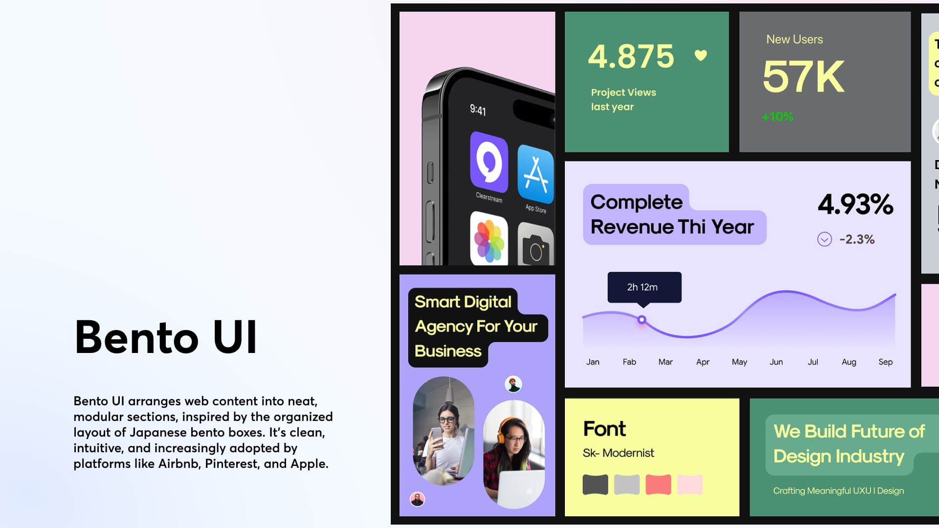
1. Bento Grid
A “separated boxes” layout inspired by Japanese bentō boxes, this design approach divides content and functionality into distinct modules. It promotes visual hierarchy and clarity, highlighting essential information without distractions.
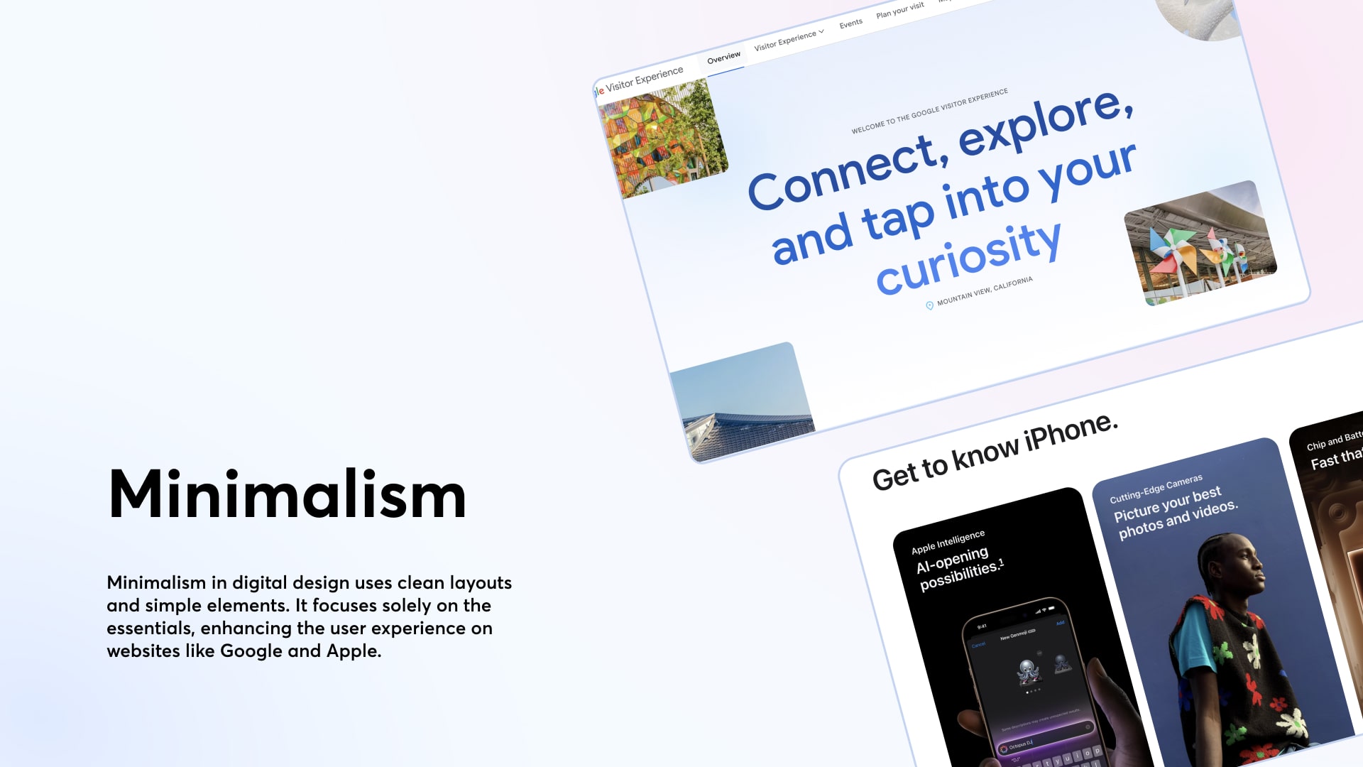
2. Minimalism
Minimalism in UI design embraces simplicity, using clean layouts, ample white space, and a limited color palette to focus the user’s attention on what truly matters. This approach removes visual clutter, improves usability, and creates a sense of calm and clarity. Leading tech companies like Google and Apple have long championed minimalist design to deliver intuitive, distraction-free experiences that feel modern and elegant.
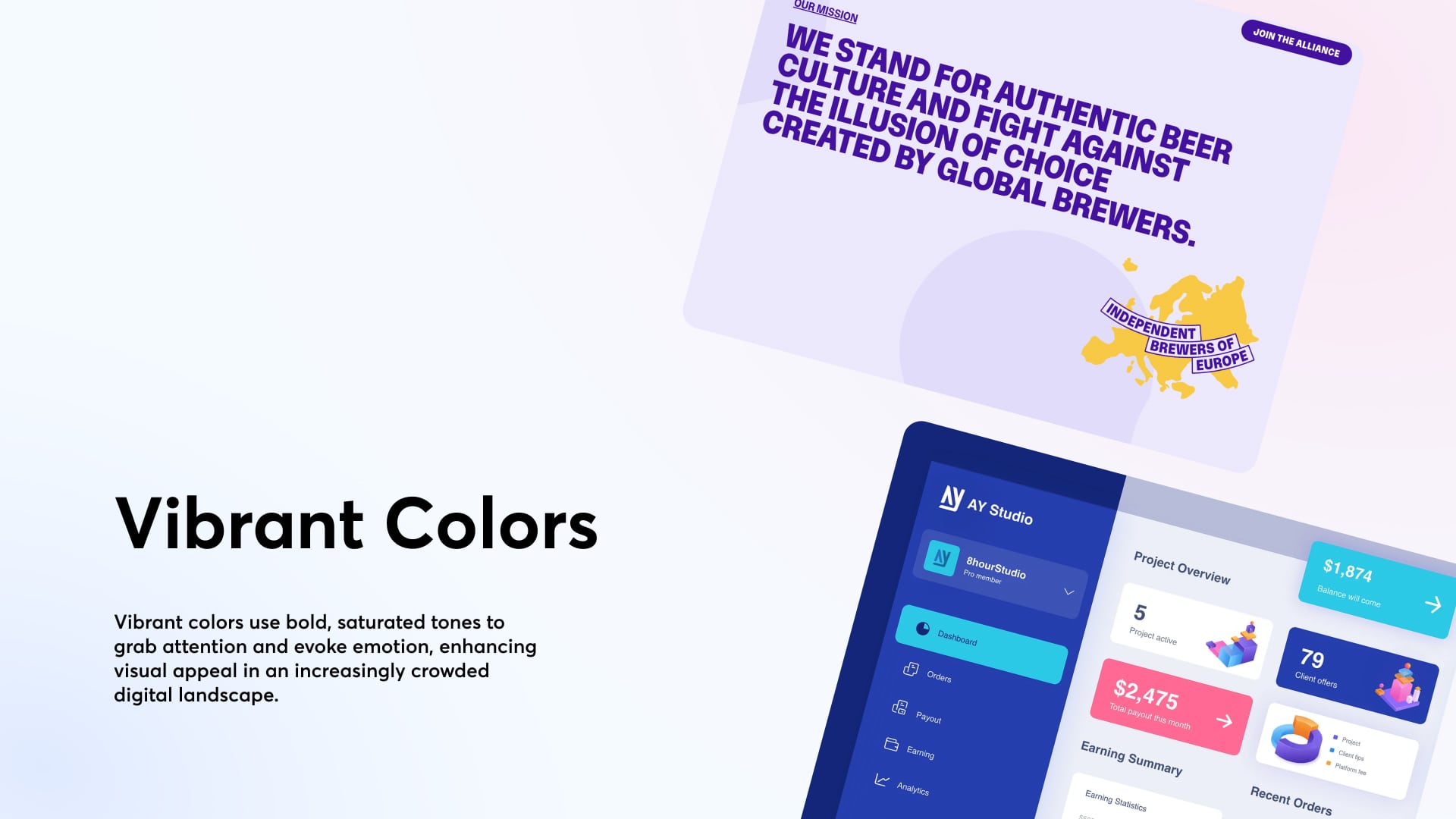
3. Vibrant colours
Vibrant colours serve as effective visual cues in UI design, drawing attention, highlighting important elements, and establishing visual hierarchy. Bright hues should be reserved for high-priority actions, while more subdued tones support secondary content, preserving clarity and focus.
Accessibility is also essential: high saturation must be balanced with sufficient contrast to ensure readability for all users, including those with colour vision deficiencies.
When used strategically, vibrant palettes can energise a design while maintaining both usability and inclusivity.
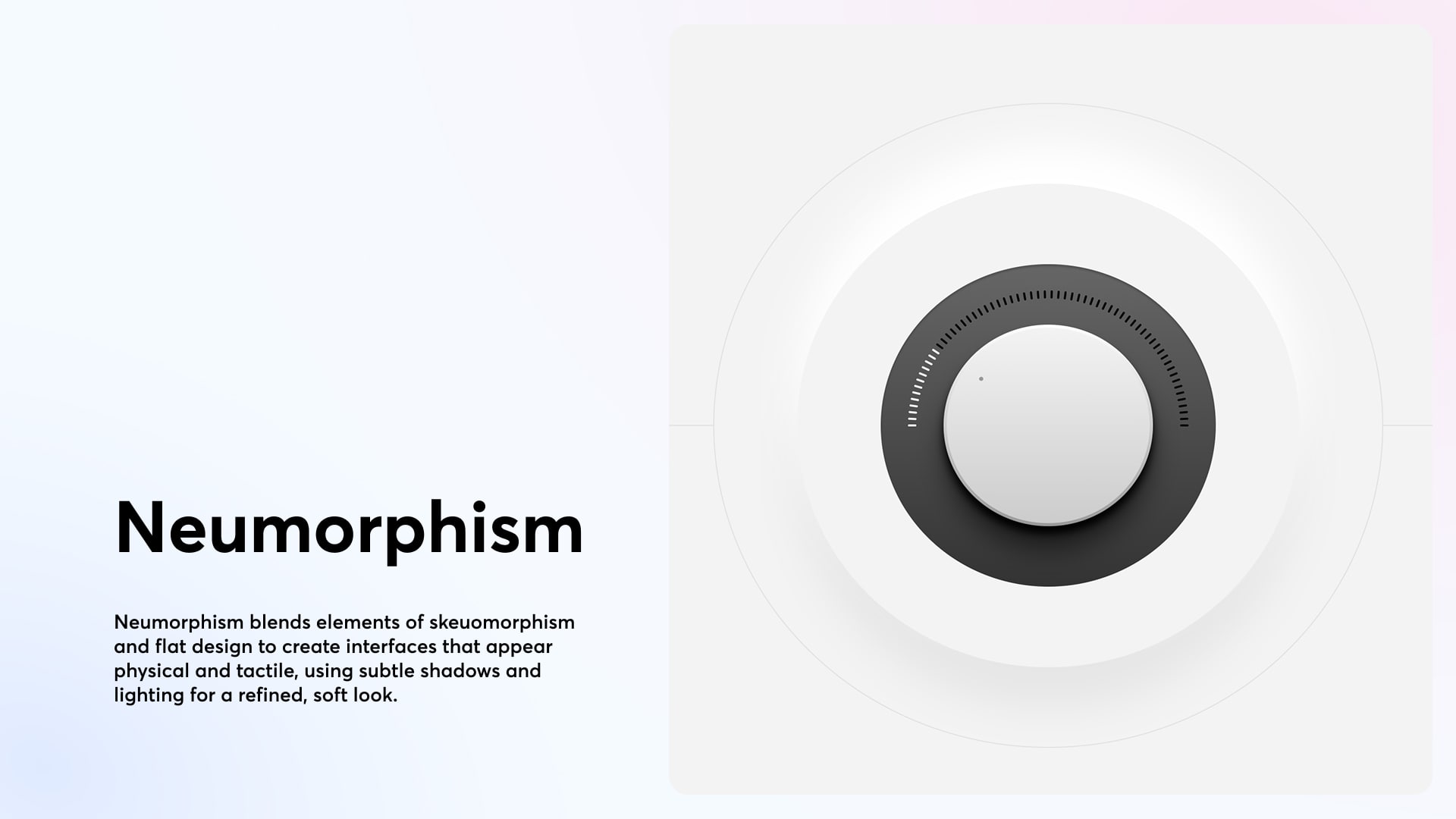
4. Morphism
Morphism is a blend of sharpness and soft blur, creating a modern, dynamic interface with a fluid-grain aesthetic.
- Glassmorphism uses translucent and frosted-glass effects to give digital interfaces a sense of depth and focus. It combines soft colours and light borders for a modern and elegant appearance;
- Skeuomorphism mimics real-world materials and objects to make interfaces more intuitive and familiar to users;
- Neumorphism merges skeuomorphism and flat design, creating soft, tactile interfaces through subtle shadows and light effects.
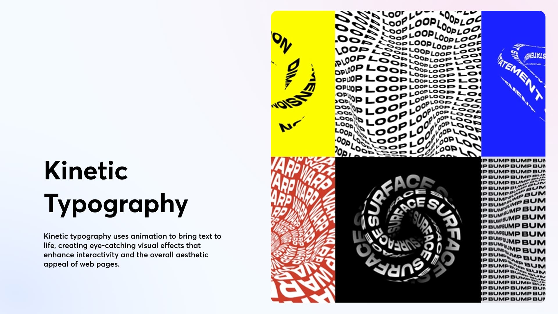
5. Typography
Kinetic Typography brings text to life with transitions and micro-animations, making interfaces more dynamic and engaging. It boosts visual appeal and interactivity while adding personality to digital communication.
Bold Typography, on the other hand, focuses on impact. Large, thick, and strong fonts immediately capture attention and convey clear, direct messages – reinforcing visual hierarchy and brand identity.
6. Microinteractions e Motion Design
Subtle animations, such as click feedback, parallax effects, and drag responses, enhance perceived responsiveness without causing distraction. They strengthen the connection between interface elements and user actions.
