Visualising Impact: The Crucial Role of Data Representation in science communication and EU Projects
In today’s data-driven world, research initiatives and EU projects are powerhouses of information. They generate vast datasets, complex findings, and crucial insights that have the potential to drive innovation, inform policy, and demonstrate significant societal impact. However, the sheer volume and complexity of this data can often be a barrier to its effective communication and understanding. This is where the art and science of data visualisation become not just beneficial, but essential.
At COMMpla, we understand that conveying the value and outcomes of your hard work is paramount. Just as a distinctive brand identity can set a project apart, clear and compelling data representation can transform how your findings are received, understood, and acted upon. For researchers and EU project coordinators, mastering data visualisation is key to unlocking the full impact of your work.

Why Data Visualisation is a Game-Changer for Researchers and EU Projects
Raw data, often locked away in spreadsheets or lengthy reports, can be opaque and overwhelming. Effective data visualisation bridges this gap, translating complex information into accessible, engaging, and understandable formats. Here’s why it’s indispensable:
- Enhanced Clarity and Understanding: The primary goal of data visualisation is to clarify. Well-designed charts, graphs, and diagrams can illuminate trends, patterns, outliers, and correlations that might be missed in numerical data alone. This makes complex findings accessible to a broader audience, including those without deep technical expertise.
- Greater Impact and Engagement: A compelling visual can capture attention, evoke understanding, and make your message more memorable, significantly boosting engagement with your research or project outcomes.
- Improved Decision-Making: When data is presented clearly, it empowers stakeholders, policymakers, and project partners to make more informed decisions. Visualisations can highlight areas of success, identify challenges, and support strategic planning.
- Effective Dissemination and Reporting: EU projects, in particular, have stringent requirements for dissemination and reporting. Data visualisations are powerful tools for communicating progress, results, and impact to the European Commission, project partners, and the wider public in a clear, concise, and compelling manner.
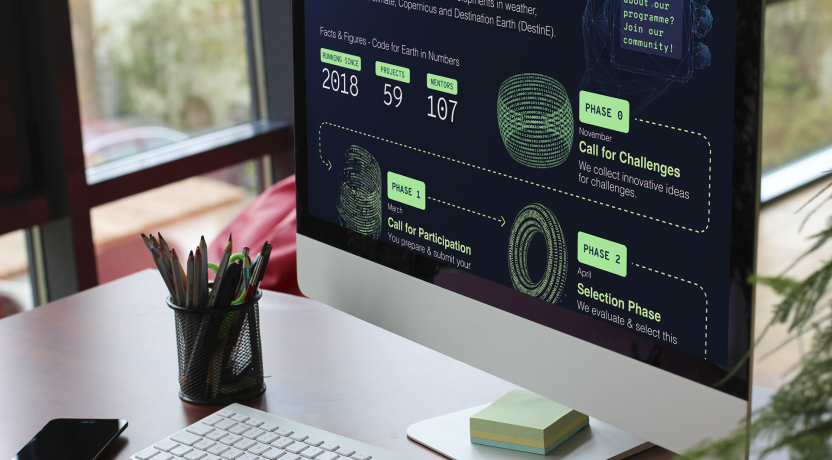
- Efficient Communication of Complex Processes: Research often involves intricate methodologies and EU projects have complex work package interdependencies. Flowcharts, process diagrams, and timelines can simplify these complexities, making them easier to grasp and communicate.
Choosing Your Tools: A Palette for Data Representation
A variety of tools are available to help you represent your data effectively. The choice depends on the nature of your data and the story you want to tell:
- Tables: While seemingly basic, tables are excellent for presenting structured, precise data, allowing for easy lookup of specific values. They are effective when detailed figures and comparisons are necessary.
- Charts and Graphs:
- Bar charts are ideal for comparing quantities across different categories.
- Line charts excel at showing trends over time.
- Pie charts (use with caution) can illustrate proportions of a whole.
- Scatter plots help in identifying relationships and distributions between two variables.
- Diagrams: Flowcharts can map out processes, organisational charts can illustrate project structures, and mind maps can help in brainstorming and showing connections between ideas.
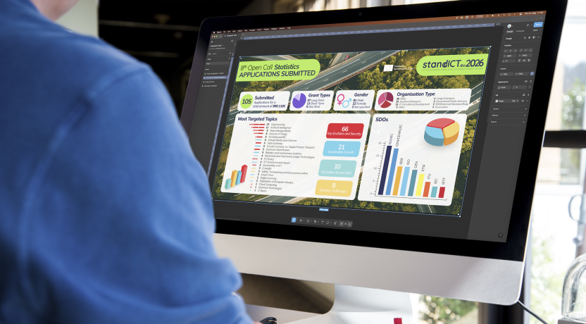
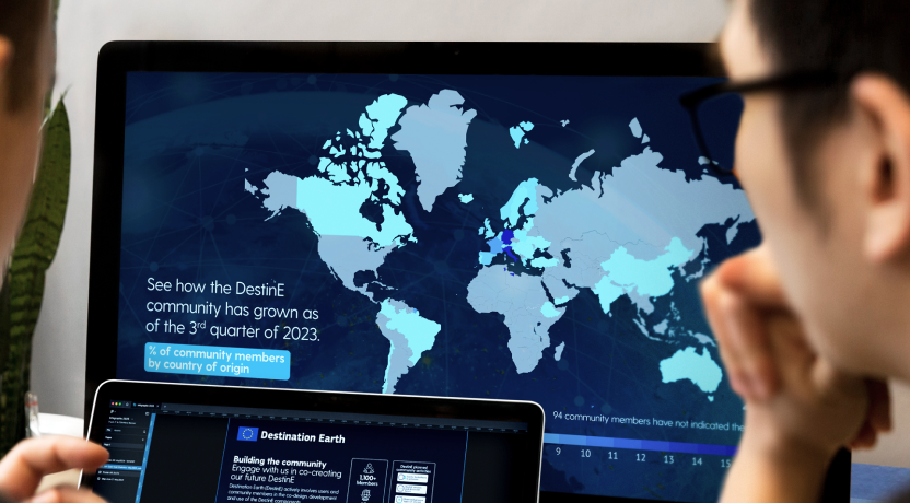
- Infographics: These are a compelling way to combine charts, icons, and concise text to tell a data-driven story. Infographics are highly shareable and excellent for public outreach and summarising key findings.
- Dashboards: For ongoing projects, dashboards provide a dynamic, at-a-glance view of key performance indicators (KPIs) and real-time data, facilitating monitoring and adaptive management.
Core Principles for Powerful Data Visualisation
Creating effective data visualisations is more than just making pretty pictures. It requires adherence to key principles:
- Accuracy: The visualisation must faithfully represent the data. Misleading visuals can erode trust and lead to incorrect conclusions.
- Clarity: The message should be instantly understandable. Avoid clutter, unnecessary jargon, and overly complicated designs. Use clear labels, titles, and legends.
- Purposefulness: Every element in your visualisation should serve a clear purpose in conveying your message. Ask yourself: “Does this element help understanding?”
- Audience Awareness: Tailor your visualisations to the intended audience. A detailed chart for a scientific peer group might differ significantly from an infographic designed for the general public.
- Context is Key: Provide sufficient context – through titles, captions, or accompanying text – to ensure your audience can correctly interpret the visualisation.
- Simplicity and Elegance: Often, the most effective visualisations are the simplest. Focus on clear communication rather than decorative flair.

Elevating Your EU Project with Strategic Data Visualisation
For EU-funded projects, strategic data visualisation can be a powerful asset throughout the project lifecycle:
- Stronger Proposals: Visually representing your project’s objectives, methodology, expected impacts, and work plan can make your proposal more compelling and easier to understand for evaluators.
- Enhanced Reporting: Incorporating clear charts and graphs into interim and final reports can greatly improve their readability and impact, making it easier for EC reviewers to assess progress and achievements.
- Maximised Stakeholder Engagement: Presenting project updates and results visually during meetings, workshops, and conferences keeps stakeholders engaged and facilitates more productive discussions.
- Effective Public Dissemination: To meet dissemination requirements and showcase your project’s value to society, visualisations (especially infographics and accessible charts) are invaluable for reaching a broader, non-specialist audience.

Communicating Your Data, Amplifying Your Impact
In the information-rich landscape of research and EU projects, effectively communicating your data is no longer a luxury – it’s a necessity. By embracing the principles of good data visualisation and selecting the right tools for the job, you can transform complex information into compelling narratives, foster deeper understanding, and ultimately, amplify the impact of your work.
Just as we help projects craft distinctive identities, COMMpla recognises the power of clear communication in all its forms. Ensuring your data tells its story effectively is a crucial step towards achieving your project’s goals and leaving a lasting legacy.
