Why a Beautiful Interface Doesn’t Guarantee a Good UX
You have probably landed on a gorgeous website (smooth animations, polished typography, flawless colours) only to feel lost after thirty seconds, unsure where to click.
The opposite happens too: a plain, even dated-looking site where you find what you need in seconds and complete your task with ease. Good UI doesn’t guarantee good UX.
The “beautiful but unusable” problem
Many websites are built to impress: to stand out, win design awards, or land in a portfolio. The risk is that aesthetics take priority over function and homepages become cinematic experiences full of preloaders, scroll animations, and menus hidden behind unconventional interactions. The result: users don’t know what they can do, where the menu is, or how to find what they came for.
This shows up especially often in e-commerce and luxury/fashion sites.
Case 1 – The e-commerce site that hides its controls. A full-page hero image with no categories or reference points. An oversized logo overlapping a transparent, low-contrast nav menu. No hover states, so users can’t tell what’s clickable. Filters are hard to find, sorting options are missing entirely.
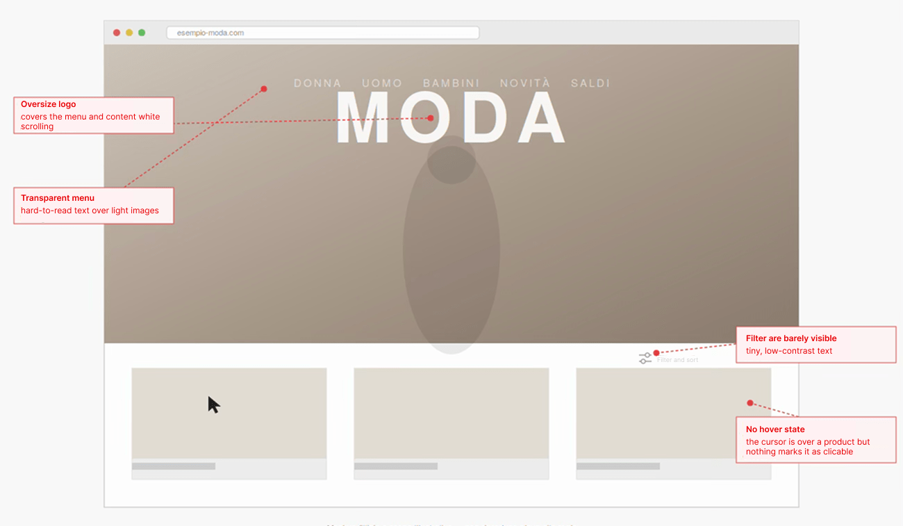
Tip: If a decorative element risks interfering with navigation, separate the two layers visually and always check behaviour on small screens, that’s usually where hierarchy problems surface.
Case 2 – The ultra-minimal site that disorients. A stripped-back aesthetic can suit a brand’s positioning, but strip away too many reference points and usability suffers. A near-invisible hamburger menu, minimal text cues, and a layout built purely on product grids can leave first-time visitors (especially those arriving from social media) unsure where to start. Quiet-luxury portfolios often fall into the same trap.
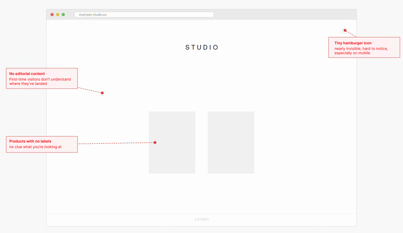
Tip: A menu can look minimal but still needs to read as a menu. A clearer icon, a text label, or a simple hover state reduces ambiguity without sacrificing style.
Case 3 – The button that gets lost. A more subtle but common issue: the main call-to-action shares the same colour and visual weight as secondary links like “Add to wishlist” or “Compare.” Users have to hunt for it instead of spotting it instantly. Repeated across the journey, this friction can hurt conversion.
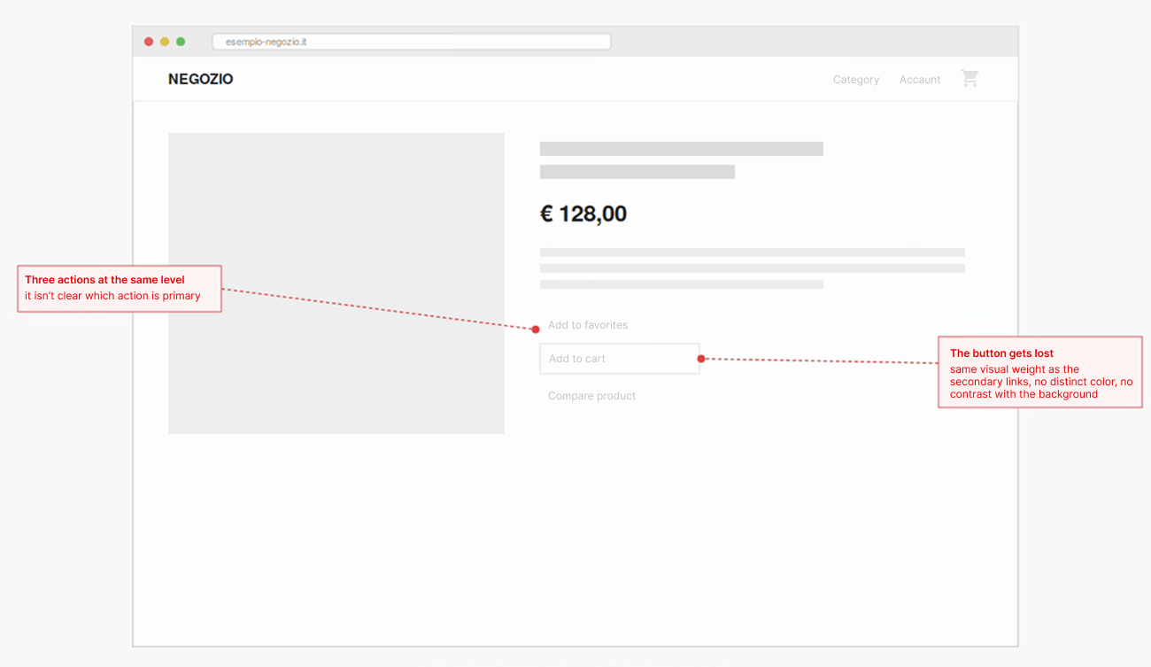
Tip: Your primary CTA needs clear visual hierarchy. If you can’t identify the main action within a few seconds of looking at the page, something needs rethinking.
“Ugly but effective”
At the other extreme are sites few would call beautiful, yet which work remarkably well.
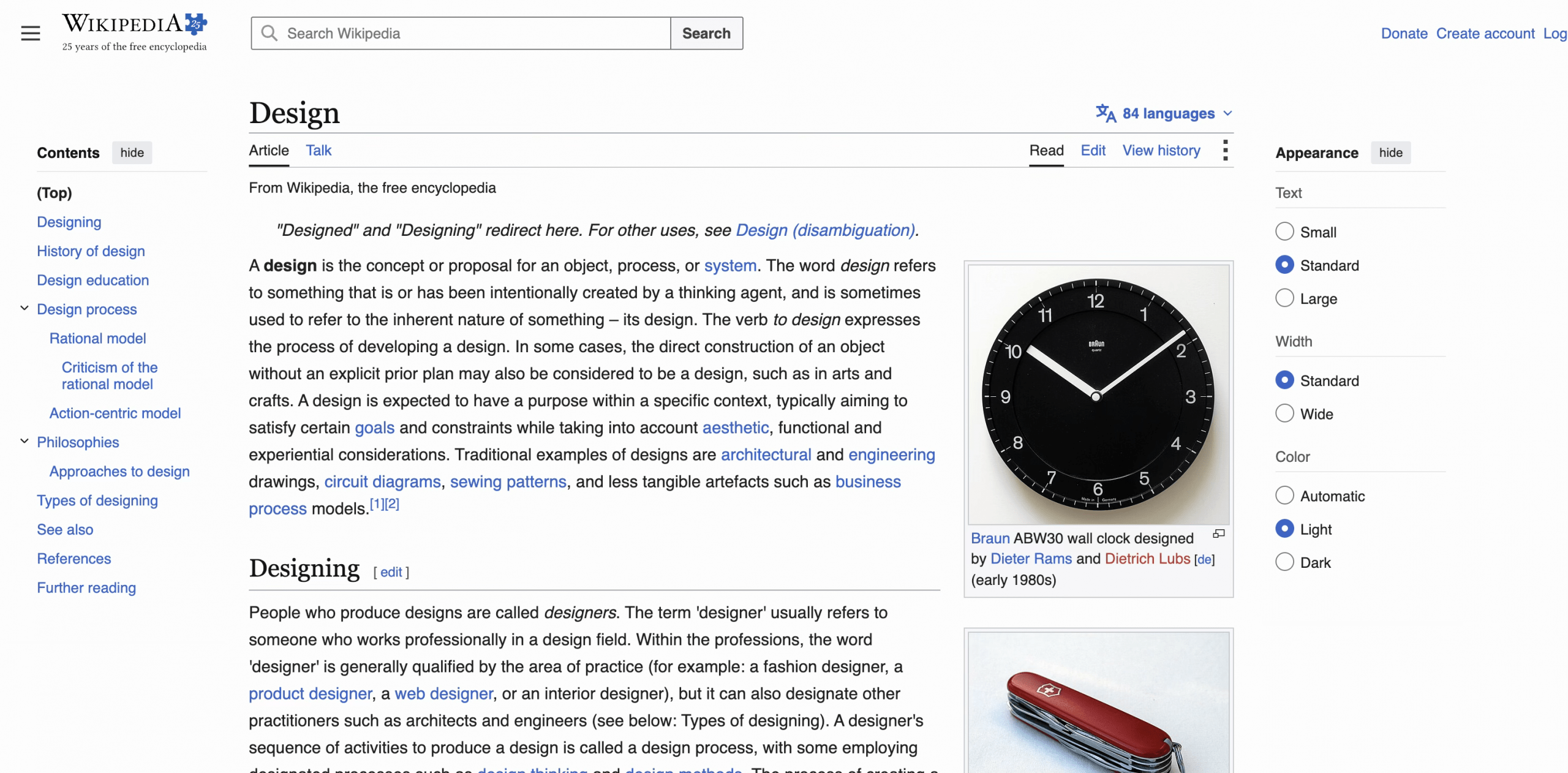
Wikipedia uses system fonts, almost no decoration, and a layout that’s stayed largely unchanged. It works because content hierarchy is clear, links sit where you expect, and search gets you to information fast.
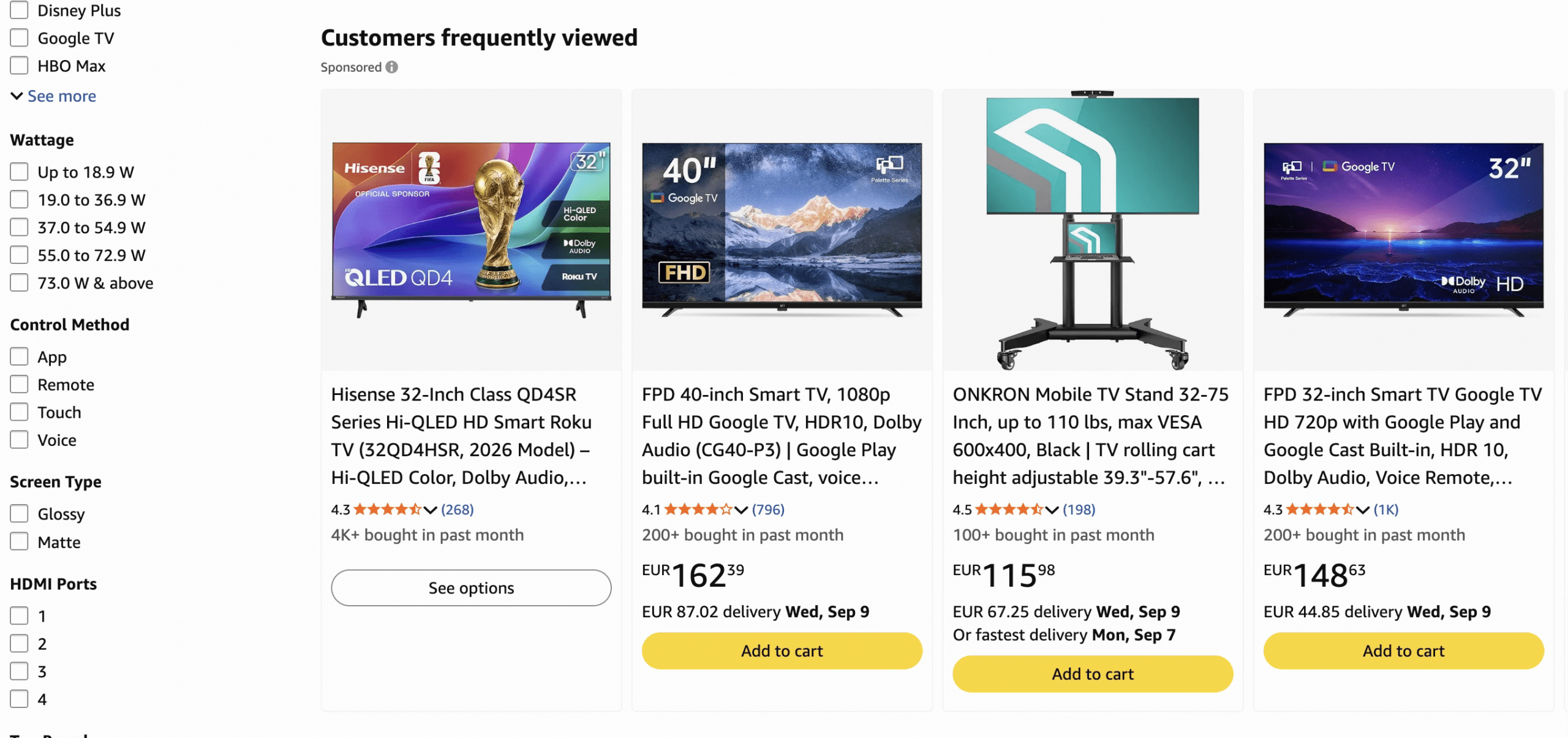
Amazon is visually far from minimalist (dense, information-heavy pages), but the density serves a purpose: reducing friction to purchase. Price, reviews, availability, and CTAs are all easy to spot and guide users straight to a decision. The goal isn’t a portfolio piece; it’s the most effective path possible.
Why This Happens: Two Disciplines, Two Goals
Problems arise when UI and UX are treated as separate disciplines. A designer might focus on visual impact without fully accounting for real user behaviour; equally, an interface can follow usability conventions without enough attention to how aesthetics and brand identity shape the experience.
In reality, the two should work together. UI focuses on perception and interaction, UX looks at the overall journey. Good experiences happen when both are designed together and tested with real users.
Signals to Watch For
Beautiful but hard to use:
• Menus that must be discovered rather than instantly recognised
• Evocative but vague labels (“Universe” instead of “Products”)
• Animations that slow the journey instead of supporting it
• A primary CTA that blends in with secondary elements
• Long scrolling before you understand what the site actually offers
Not beautiful but effective:
• Quick to understand how to reach your goal
• Short, predictable path
• Important information is easy to spot
• Usable even on older devices or slow connections
• Follows established web conventions: recognisable menu, logo linked to home, easy-to-find cart, consistent CTAs
Looking ahead
It comes down to one question: can someone who doesn’t know you reach their goal effortlessly?
Aesthetics can grab attention, but if they force users to search, wait, or guess, that value fades fast. “Beautiful but unusable” and “ugly but effective” are two extremes of the same mistake, treating form and function as separable. They aren’t. The right question isn’t “Is my site beautiful?” but “Does it make it easy to get where the user wants to go?”
As AI-driven and conversational interfaces take on more of the “navigation” work (search bars that understand intent, assistants that complete tasks directly) the UI/UX gap won’t disappear, it will shift. The interface itself may become less visible, but the same question will still decide whether it works: does the user reach their goal with as little friction as possible?
Beauty will matter less as a static layout and more as the quality of a system’s responses: clear, fast, and trustworthy at the moment it’s needed.
Maria Laura De Sury | UX & Web Designer